
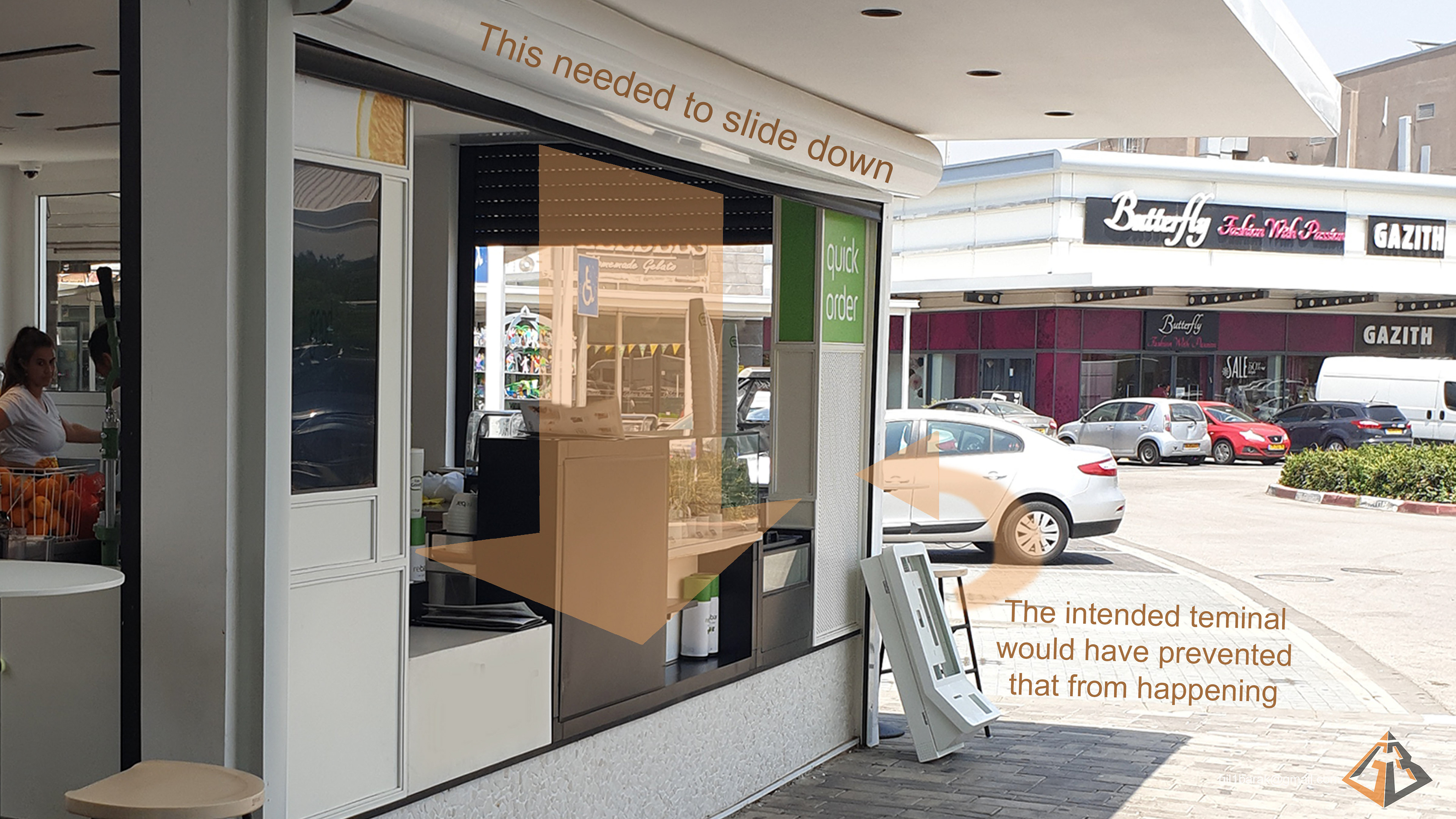
While working at "Artbox House of creations", I was assigned to redesign a generic self service terminal
that is used throughout the locations of a brand,
in order for it to fit in one of their branches Which has a space problem for it:
that is used throughout the locations of a brand,
in order for it to fit in one of their branches Which has a space problem for it:
(It should go without saying, that I've received permission to put this here)
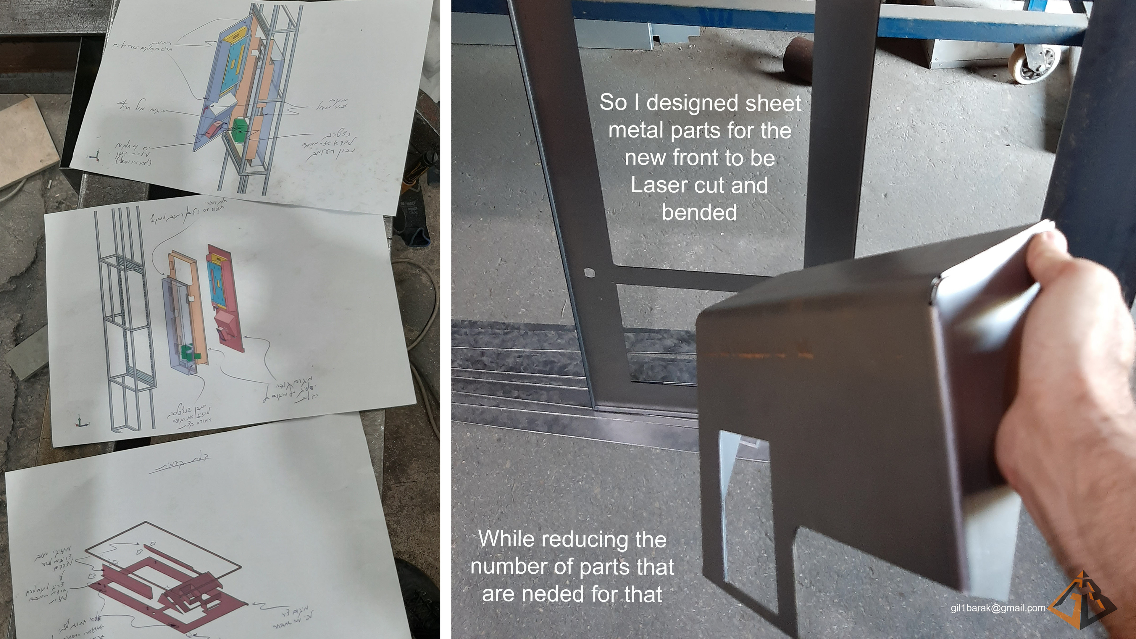
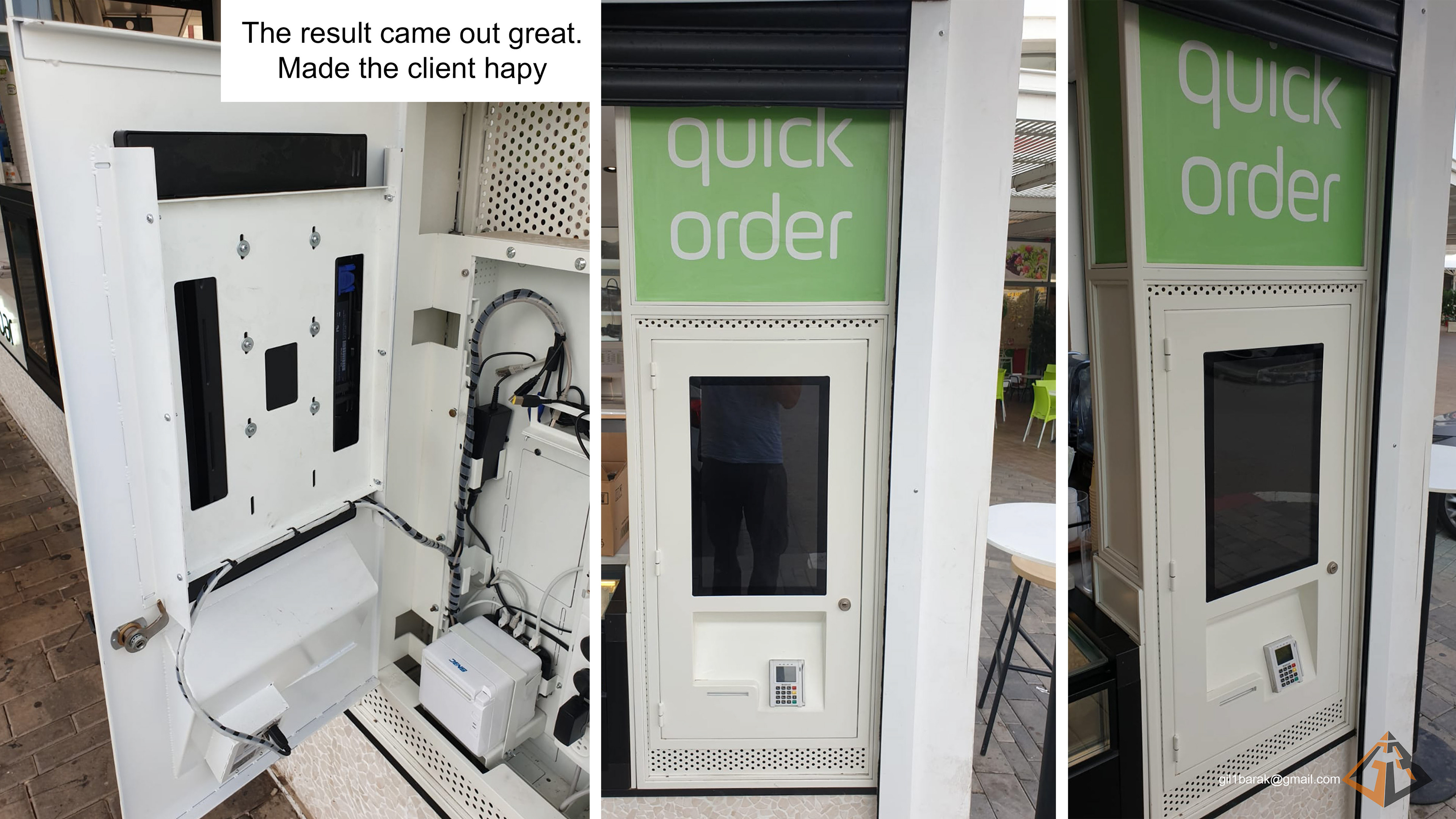
Although this terminal face is relatively simple in shape,
I did manage to add a visual element to keep it "on brand".
I did manage to add a visual element to keep it "on brand".
Can you spot it?